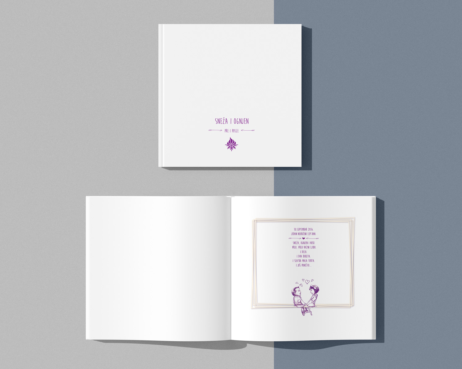
This logo or emblem was created as a gift to friends who were getting married. Ognjen and Snežana are a very nice couple and since I know them, I neither planned nor developed the idea.
I just sat down one day before their wedding and created this logo within minutes.
The inspiration was to unite the meaning of their names. Ognjen means fire in the Serbian language, and Snežana means Snow White. It should be obvious. A fire burning on stacked logs and snowflakes, as a symbol of the name Snow White.

After their wedding, I made them a book with a hardcover that was symbolically composed of things dear to them.
There was no design on the front page because it was supposed to be some kind of wedding photo album.
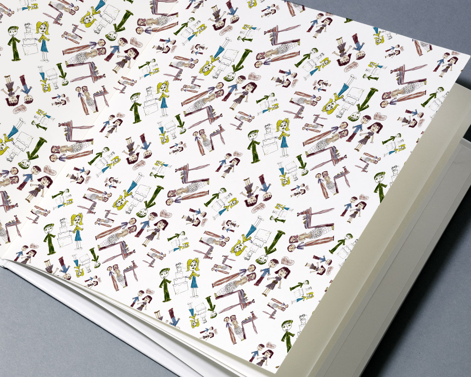
At the very beginning of the book is the endpaper that I compiled from the repetition of children’s drawings.
Endpaper is the inner side of the cover that connects the book and the coverpage and is most often made of thinner paper. That paper is glued onto the inside of the cover and the first side of the book block.
Ognjen’s nieces once drew him and his wife on paper and I used that as a motive. In the end, the result was great, and endpaper is, in my opinion, an indispensable space for a personal touch to the book. I remember that when I was a kid I liked to watch endpapers of Disney books.
In fact, I would say that if you don’t have an idea for forzec, then connect a soft-bandaged book.
Later, I made them a logo stamp, which they were supposed to use for fun as needed. The purple color that runs from the beginning has symbolism and is not accidental, although I would say that the perfect fusion is red and blue, which would be a symbol of warm and cold.


