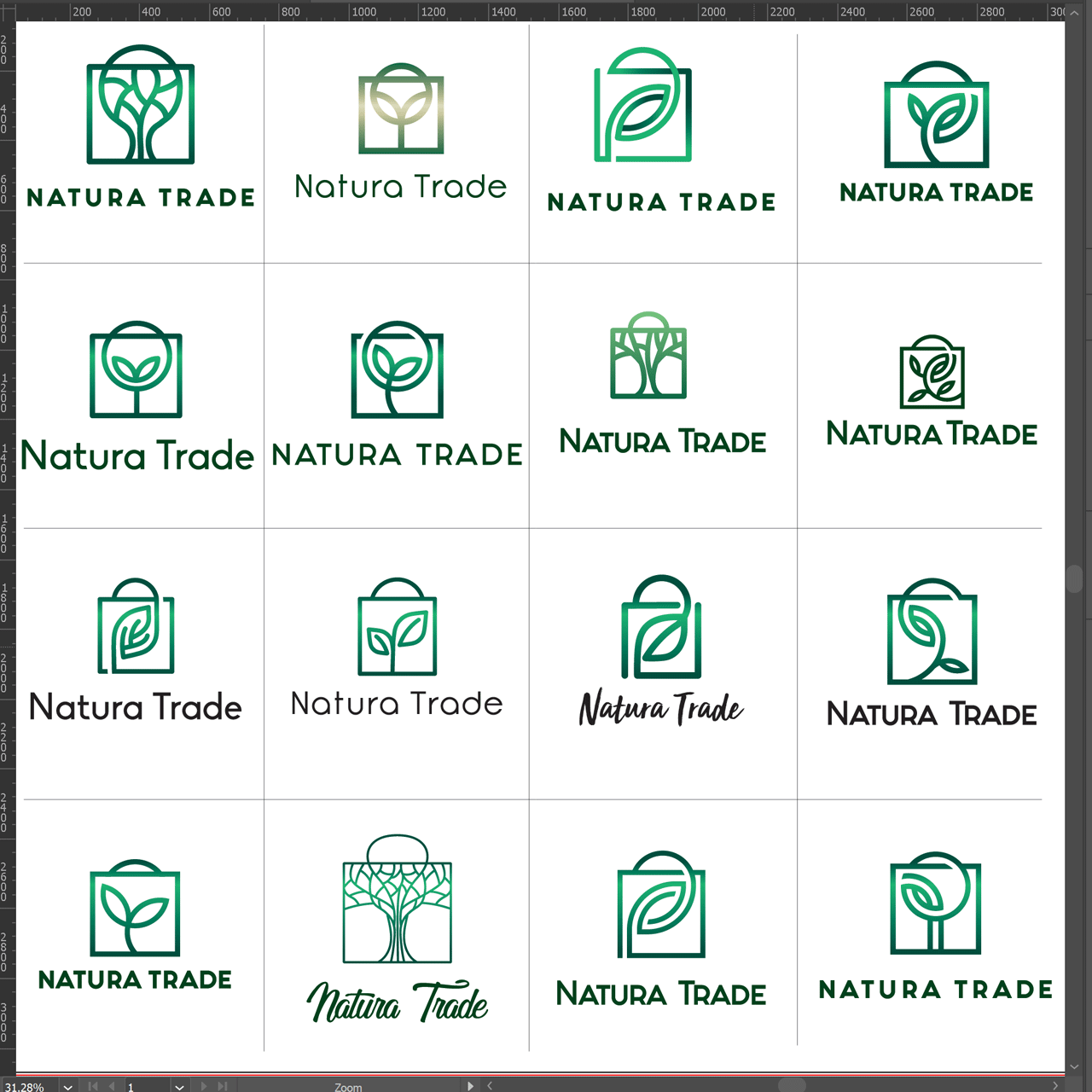
Natura Trade is a company from Loznica that has been operating for more than a decade and focuses its activities on the production of paper bags. Since these are ecological and recycled products, I wanted to incorporate nature, leaf or wood in a sign. In addition, the bag should appear as an element.

Further development of the logo is focused on geometric forms and colors that may be closer to the natron – recycled paper from which bags are made. I had doubts about whether to throw out the bag or not, but we still stayed with that solution.

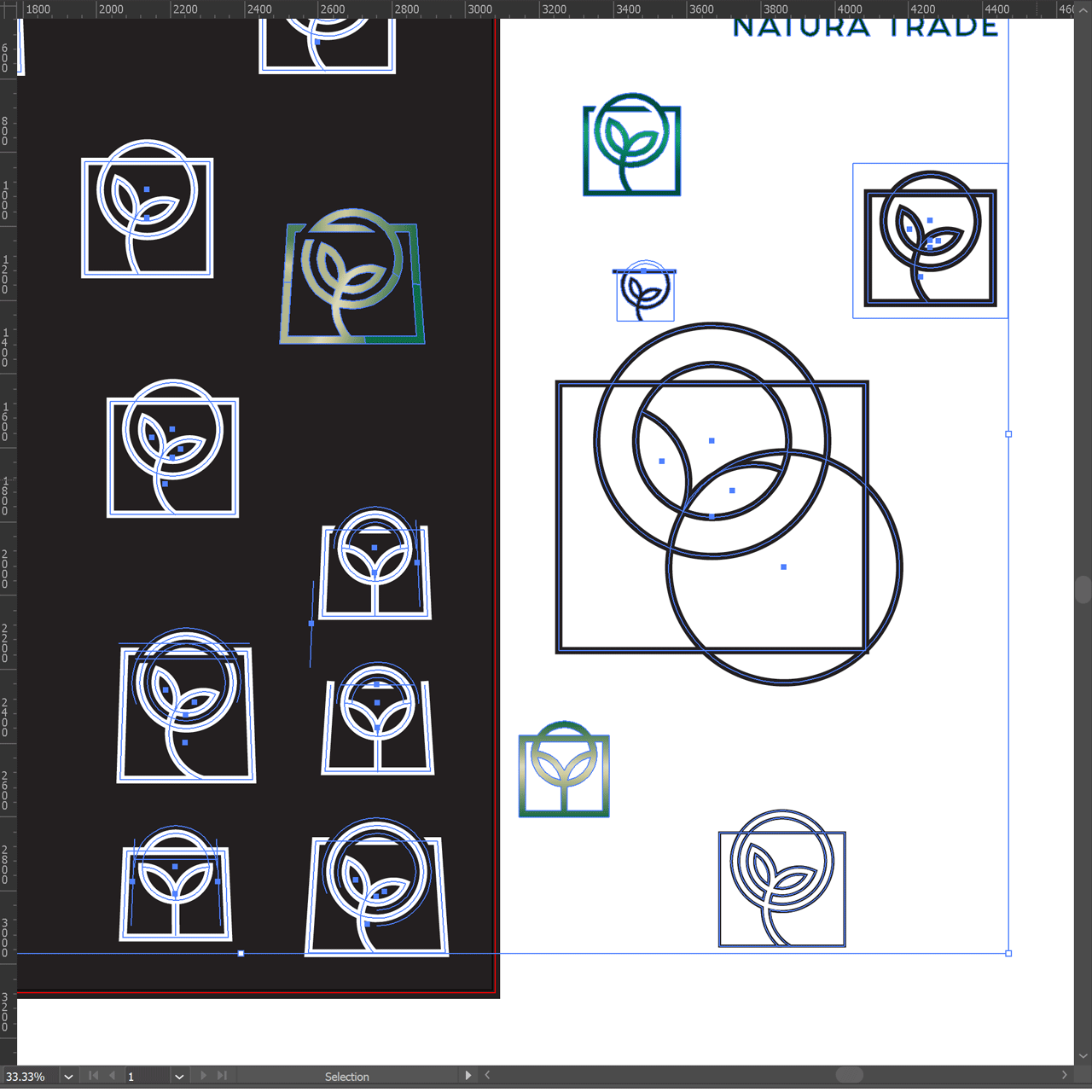
The geometry from which the sign is constructed is from the circles that intersect and the rectangle. However, I opted for a rectangular shape, not a square, because it is more approximate to the format of paper bags by standards. By maintaining the rectangular shape, it is easier to notice the stylization of the bag at first glance.

I further determined the standards, i.e. applying the logo to different surfaces.


